Control Chart
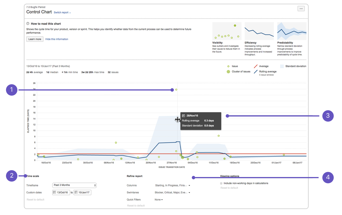
- 1.Issue details: See the cycle time for an issue.
- 2.Time scale: Select a time period to display on the control chart.
- 3.Zoom in: Highlight an area of the chart to focus on a specific time period.
- 4.Refine report: Select the columns and filters you want data for.
About the Control Chart
-
The Control Chart shows the Cycle Time (or Lead Time) for your product, version, or sprint. It takes the time spent by each issue in a particular status (or statuses), and maps it over a specified period of time. The average, rolling average, and standard deviation for this data are shown.
-
A Control Chart helps you identify whether data from the current sprint can be used to determine future performance. The less variance in the cycle time of an issue, the higher the confidence in using the mean (or median) as an indication of future performance.
-
Here are some of the ways that you could use a Control Chart:
- Analyze your team’s past performance in a retrospective,
- Measure the effect of a process change on your team’s productivity,
- Provide external stakeholders with visibility of your team’s performance, and
- For Kanban, use past performance to set targets for your team.
Viewing the Control Chart
- 1.Navigate to your desired board.
- 2.Click Reports, then select Control Chart.
- 3.Configure the chart as desired. The screenshot at the top of this page highlights the controls that you can use to configure the Control Chart.
- Tip: Click How to read this chart at the top of the report to view a short description of the report.
(警告) If you are using Internet Explorer 8, the Control Chart will not work.
Printing the Control Chart
- To print the report, view the report and use the print functionality for your browser. The report will fit on either A4- or Letter-sized pages in both portrait and landscape modes (note, there is a known issue printing in landscape using Chrome).
Understanding the Control Chart
- Before you start using the Control Chart, you should get to know how it works. The following questions and answers cover the key functionalities of the Control Chart:
 What is cycle time and lead time?
 How is cycle time determined?
 How is rolling average calculated?
 What does the blue shaded area represent?
 What do the dots on the chart represent?
 Why does the scale of the Elapsed Time axis change when I change Timeframe?
Tips and examples
Learn how to tweak your Control Chart to show the data you need with the following examples:
Show me some tips… Learn how to interpret a Control Chart with the following examples:
Show me some examples…
Known issues
If you encounter an issue that is not on this list, please raise it in our issue tracker.
Click to view known issues…
Next steps
(信息) Need help? If you can’t find the answer you need in our documentation, we have other resources available to help you. See Getting help.